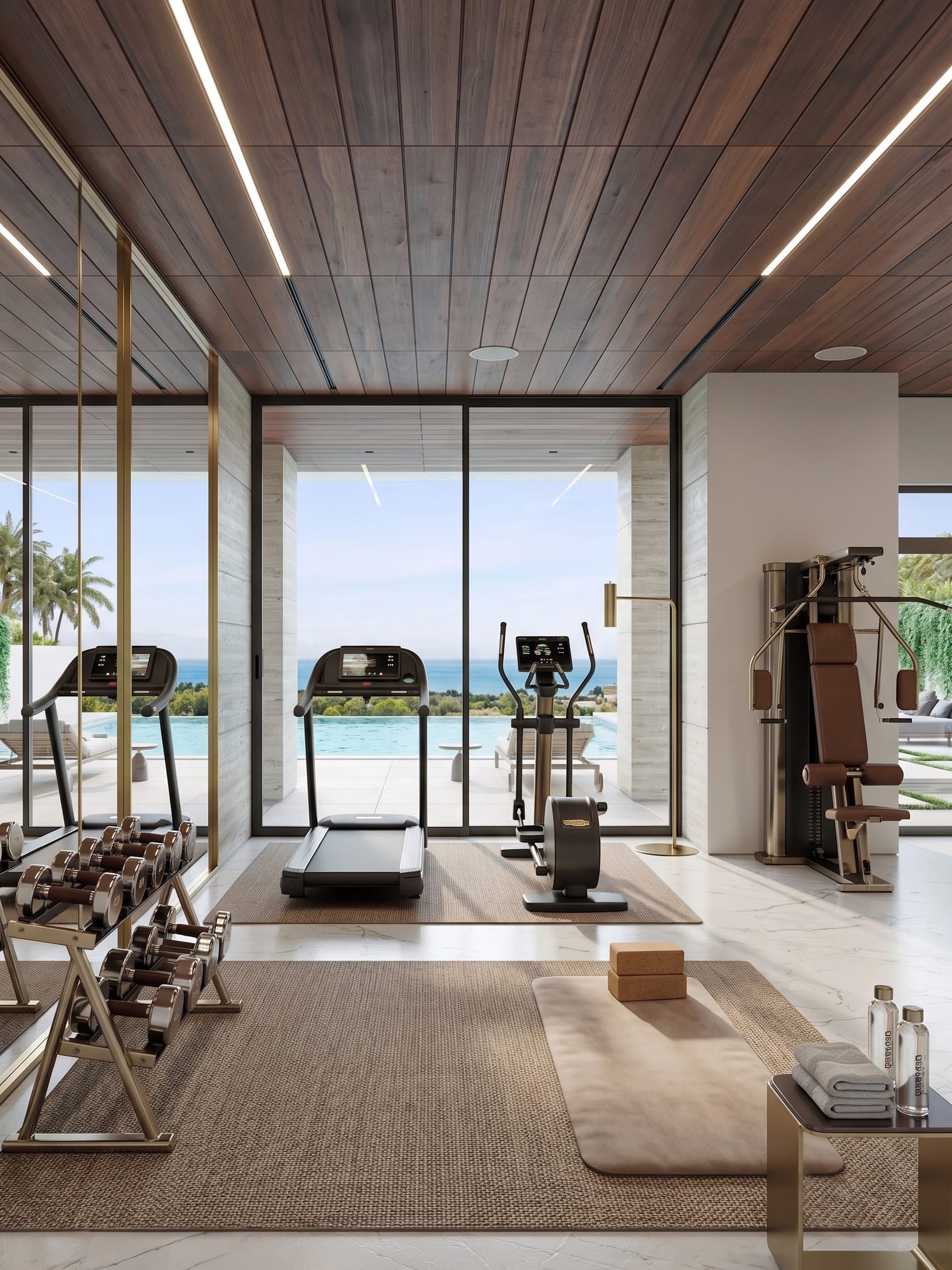
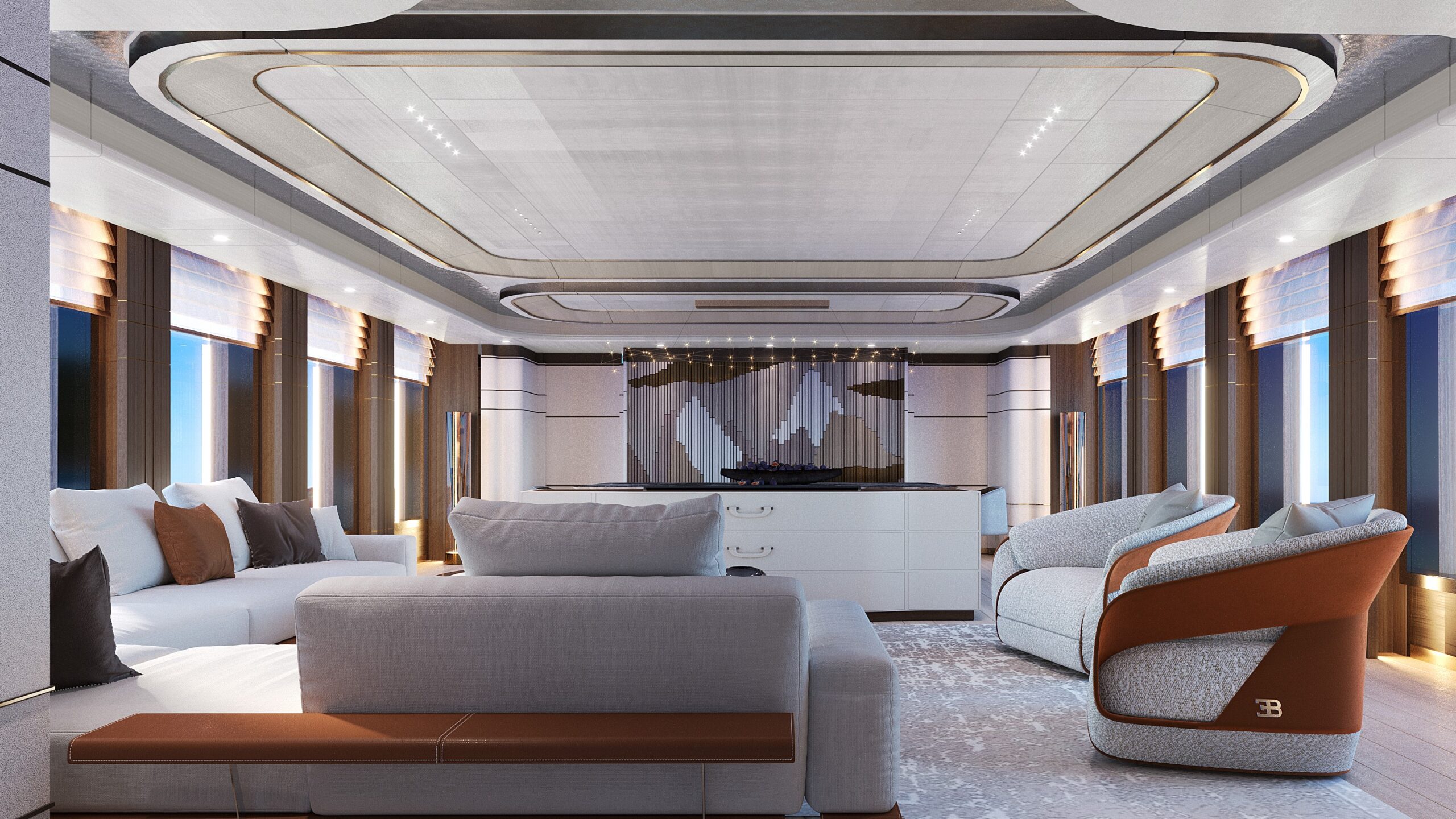
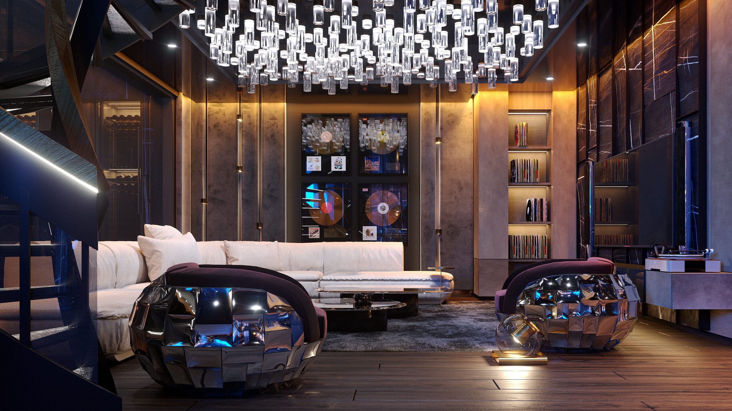
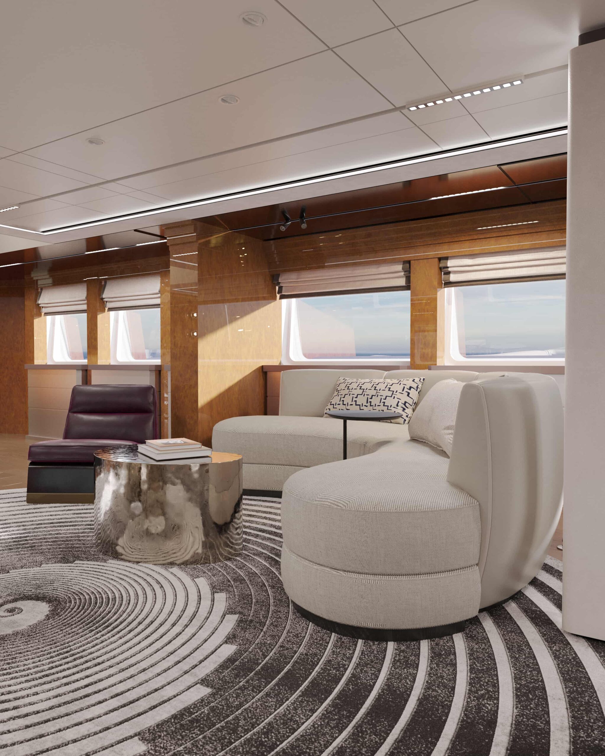
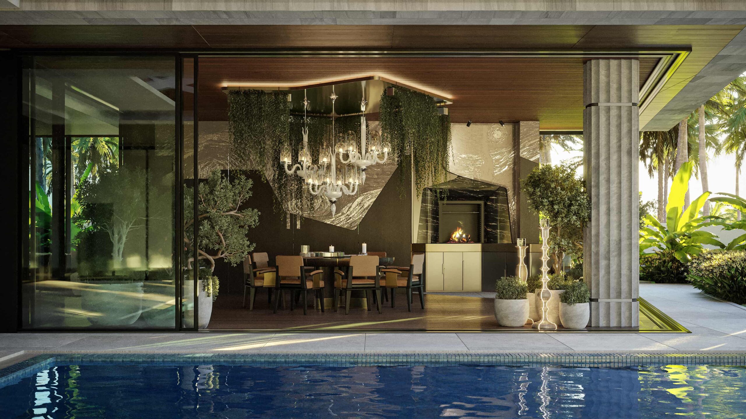
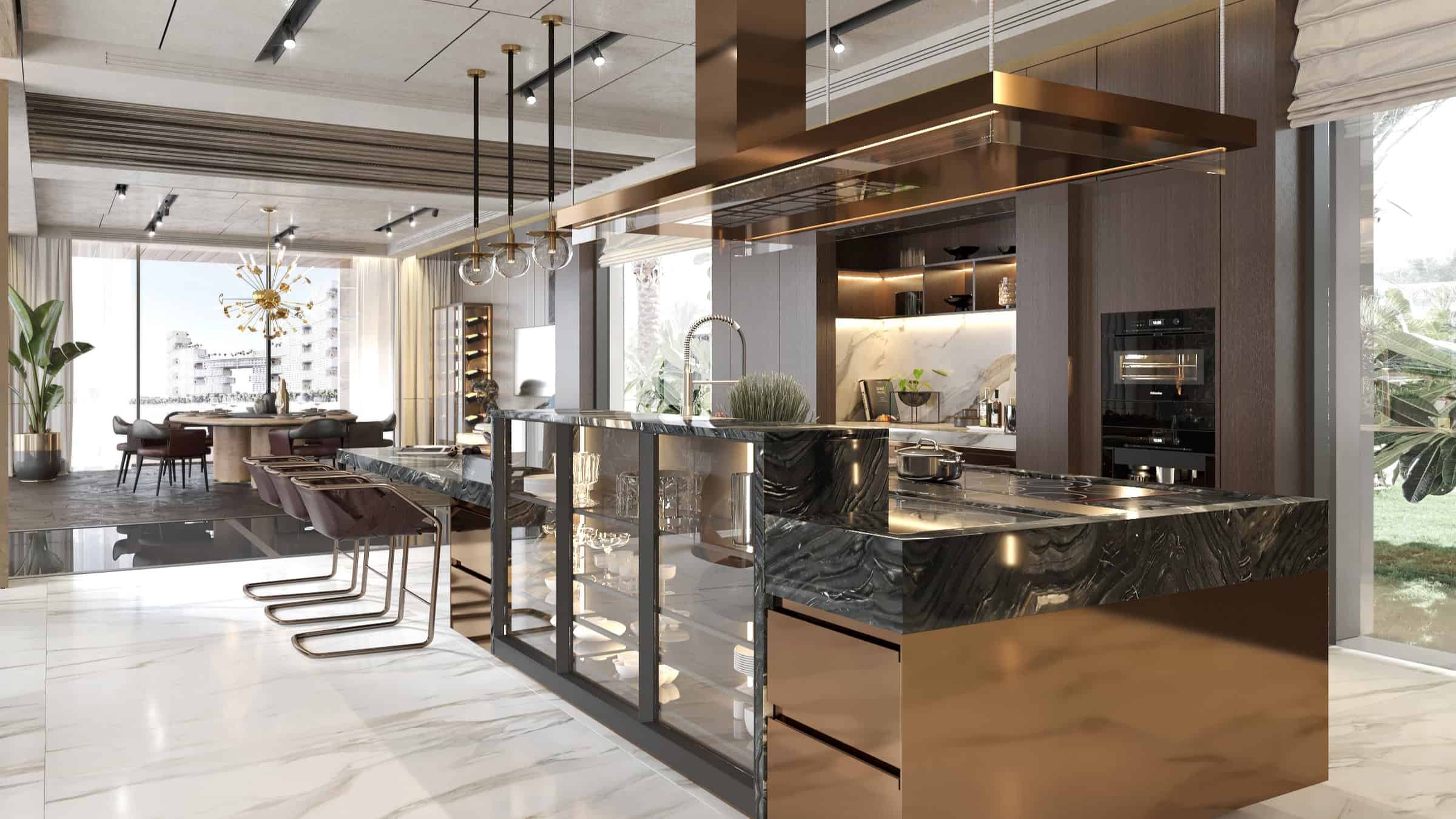
Discover how color in interior design influences mood, emotions, and space perception to create a harmonious and balanced home.
Color in interior design is a fundamental aspect that influences the atmosphere of a space, the emotions of its inhabitants, and even their behaviors. While many homeowners and designers focus on aesthetics, the psychological impact of interior design and color is often underestimated. The right color choices can create harmony, boost productivity, or instill a sense of tranquility.
This article explores the fascinating interplay between color theory, psychological influence, and practical applications in interior design, ensuring that every choice contributes to a well-balanced and aesthetically pleasing environment. We will dive deeper into the science of color, practical tips for selecting the right hues for different spaces, and real-world applications that demonstrate the transformative power of color psychology in interior design.

Color Theory in Interior Design
Understanding the principles of color theory is essential for any designer. Interior design and colors are more than just visual elements; they influence emotions, behaviors, and the overall perception of a space. Color theory incorporates scientific, psychological, and artistic principles to create a harmonious environment that aligns with the function of a given space.
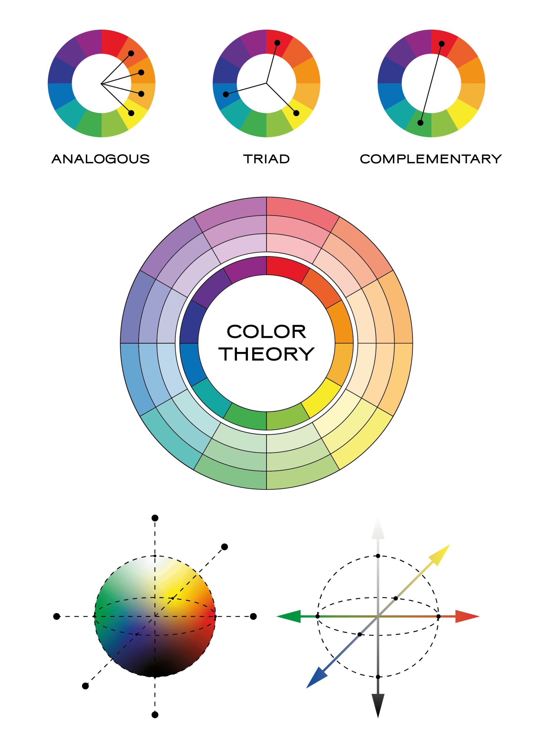
One of the foundational concepts in color theory is the color wheel, which serves as a tool for understanding the relationships between colors. Different color schemes — such as complementary, analogous, triadic, and monochromatic — allow designers to craft spaces that evoke specific emotions and functionality.
A well-designed interior space incorporates a combination of colors that work together cohesively, balancing contrast, saturation, and harmony. Designers carefully assess the impact of light, textures, and material finishes to maximize the desired psychological effect of a color scheme.
The Color Wheel and Its Importance
Interior design color psychology wheel helps designers understand how colors interact, forming the basis of effective color combinations. Understanding how different hues work together is crucial for creating visually appealing and functional spaces.
- Complementary colors (e.g., blue and orange, red and green) create a high level of contrast, making them excellent for dynamic and energetic spaces. When used in moderation, they add vibrancy and excitement.
- Analogous colors (e.g., blue, green, and teal) provide a smooth, harmonious transition between shades, making them ideal for creating calming and cohesive environments.
- Triadic color schemes (e.g., red, yellow, and blue) use three evenly spaced colors on the wheel, offering a bold yet balanced approach that works well in spaces requiring stimulation and creativity.
- Monochromatic schemes focus on varying shades, tints, and tones of a single color to create an elegant, cohesive look that is both sophisticated and relaxing.
The strategic use of these color meaning interior designs allows people to achieve the perfect balance between energy, comfort, and functionality.
Warm and Cool Colors in Interior Spaces
Colors in interior design are broadly categorized into warm and cool tones, each carrying specific emotional and psychological effects that influence how a space is perceived.
- Warm colors (red, orange, yellow) evoke energy, passion, and warmth. These colors are ideal for social areas such as living rooms, dining rooms, and entertainment spaces, where they encourage interaction and create a sense of excitement.
- Cool colors (blue, green, purple) bring a sense of calm and relaxation, making them perfect for bedrooms, offices, and meditation spaces. Cool hues, for example blue color in interior design, are also known to visually expand a room, making smaller areas feel more open and airy.
Understanding these distinctions helps in selecting the most suitable colors for different functions within a home or workplace, ensuring that spaces support the activities and moods intended for them.
The Impact of Neutrals in Interior Design
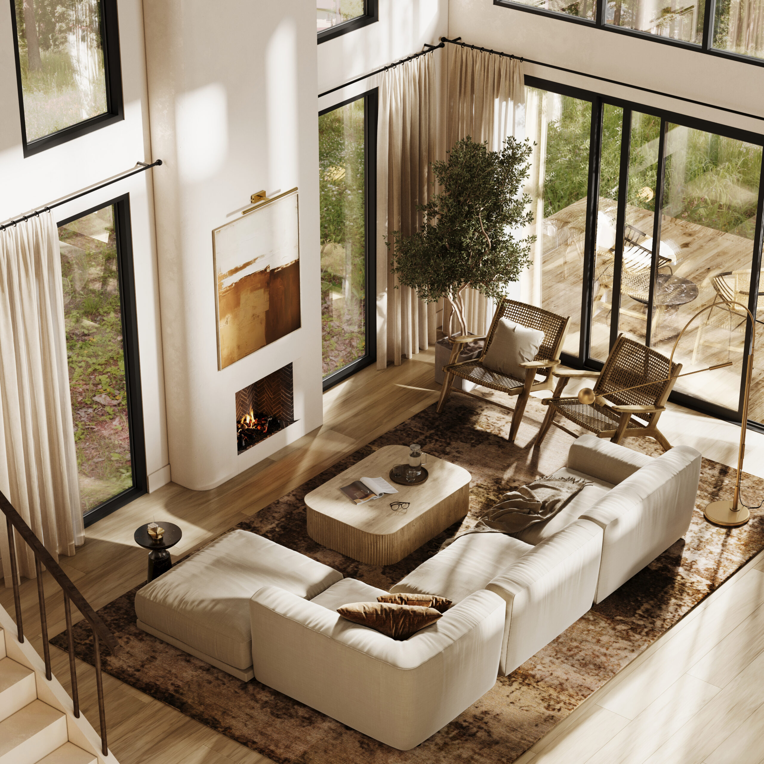
Neutral colors play a crucial role in interior design, offering a timeless and versatile backdrop that can be easily adapted to various styles and moods. While they may appear understated, neutrals have a significant impact on the perception and feel of a space.
- White symbolizes purity and openness but can feel sterile or cold if overused. Pairing white with warm textures, wood accents, or soft lighting helps create a more inviting atmosphere.
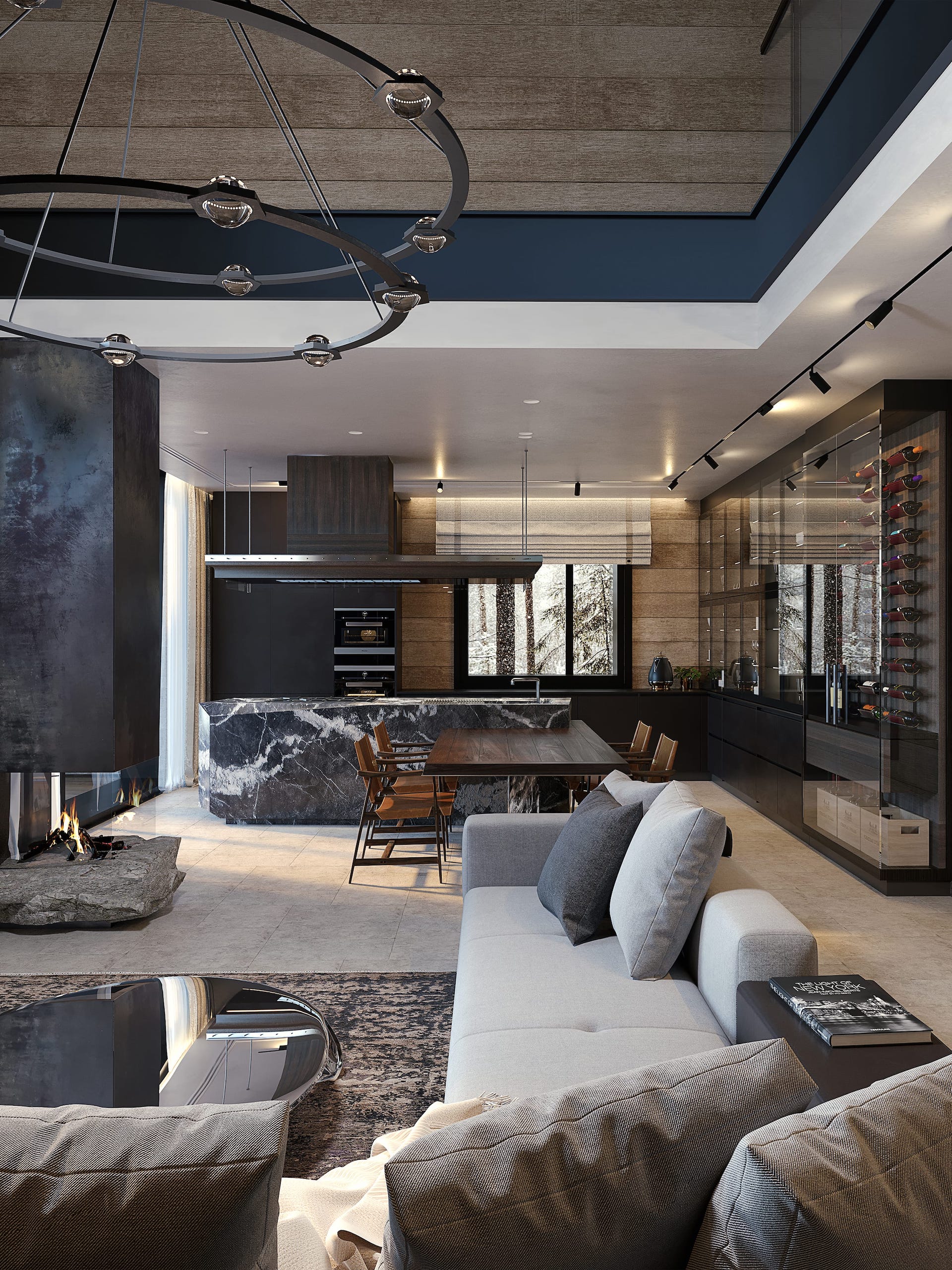
- Gray conveys sophistication and balance, making it a staple in modern and minimalist interiors. It serves as a neutral base that allows for bold accent colors to stand out without overwhelming the space.
- Beige exudes warmth and comfort, often associated with cozy and inviting environments. It works particularly well in traditional and rustic interiors.
By strategically incorporating neutral tones, designers can create elegant and timeless interiors that serve as flexible canvases for changing styles and decor elements.
Saturation, Contrast, and Shade in Design
The intensity (saturation) and brightness (tone) of a color significantly impact its psychological effect. High-saturation colors feel bold and stimulating, while muted tones create a more subdued and sophisticated look.
- High-contrast designs (such as black and white or navy and mustard) create visual drama and excitement, making them ideal for modern and contemporary spaces.
- Muted and desaturated tones promote relaxation and subtlety, often found in Scandinavian and minimalist interiors.
- Gradual tonal transitions create a seamless and harmonious effect, making a space feel more fluid and well-balanced.
Contrast, saturation, and tonal variation can be used to emphasize focal points, create spatial depth, and guide movement within a room.
The Psychological Impact of Colors
Color meaning in interior designs has a unique psychological influence, capable of altering mood, perception, and cognitive functions. The right color choices can enhance productivity, create a sense of serenity, or stimulate excitement, depending on the desired effect.
How Colors Affect Mood and Perception
Colors play a huge role in shaping how we feel and interact with a space. The right shades can make a room feel cozy, energetic, or even more focused. Whether you’re designing a workspace, a bedroom, or just picking out a new wall color, understanding the psychology behind colors can help you set the right mood.
- Blue known for its calming effect, blue promotes relaxation and focus, making it an ideal color for bedrooms psychology. Light shades help create a soothing environment, while deeper blues enhance concentration.
- Green symbolize nature and balance, it is commonly used in wellness spaces, hospitals, and meditation areas. It brings a sense of harmony and rejuvenation.
- Red is a color associated with energy and passion, red adds warmth and excitement to a space. However, it should be used in moderation, as excessive red can feel overwhelming. It works best in areas where stimulation is desired.
- Yellow is linked to happiness and warmth, yellow is a great choice for kitchens and creative workspaces. While soft yellows can uplift mood, overly bright shades may lead to restlessness.
- Black represents sophistication and luxury, black adds depth and elegance to a room. To avoid a heavy or overpowering effect, it’s best balanced with softer hues or neutral tones.
- Purple is often associated with creativity and luxury, purple is frequently used in artistic and meditation spaces. While dark purple can create a dramatic effect, lighter shades like lavender promote relaxation and tranquility.
The Role of Red, Blue, and Black in Design
Blue, black and red interior designs, each of these colors has strong connotations and should be strategically applied in interior spaces to maximize their benefits while avoiding negative psychological effects.
- Red color is associated with energy, passion, and excitement. It can elevate heart rate and increase adrenaline levels, making it a powerful choice for stimulating spaces. However, excessive use of red may lead to feelings of anxiety or restlessness. It is best used in moderation, such as through accents, furniture pieces, or decor elements. Red is often found in dining rooms, where it can encourage appetite and conversation, as well as in fitness spaces to promote motivation and energy.
- Blue color in interior designis widely known for its calming and tranquil effects. It is often linked with trust, stability, and productivity, which is why it is a common choice in corporate environments and home offices. Different shades of blue evoke different emotions: light blue fosters a sense of serenity and openness, while dark blue conveys sophistication and authority. Bedrooms painted in shades of blue can improve sleep quality by creating a peaceful ambiance.
- The color black represents power, sophistication, and elegance. When used thoughtfully, it can add depth and drama to a space. However, overuse of black can make a room feel heavy or claustrophobic. It pairs well with lighter shades, such as white or beige, to create a balanced and modern aesthetic. Black is often seen in high-end interiors, luxury hotels, and minimalistic designs where it adds an element of refinement and exclusivity.
Choosing the Right Colors for Different Rooms
Each room in a home or office serves a different function, and color choices should reflect the intended purpose of the space. Understanding how different hues influence behavior and emotions is crucial in selecting the best colors for each setting.
Best Colors for Bedrooms
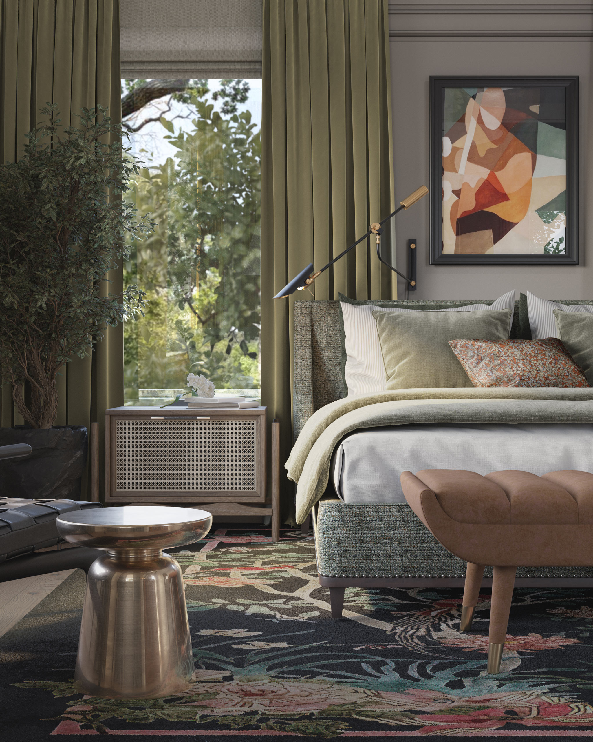
Color for bedrooms psychology should be restful and conducive to sleep. The best psychology of room colors choices include:
- Soft blues promote relaxation and reduce stress, making them ideal for creating a soothing atmosphere.
- Muted greens evoke nature and balance, helping to establish a tranquil environment that aids in mental and physical relaxation.
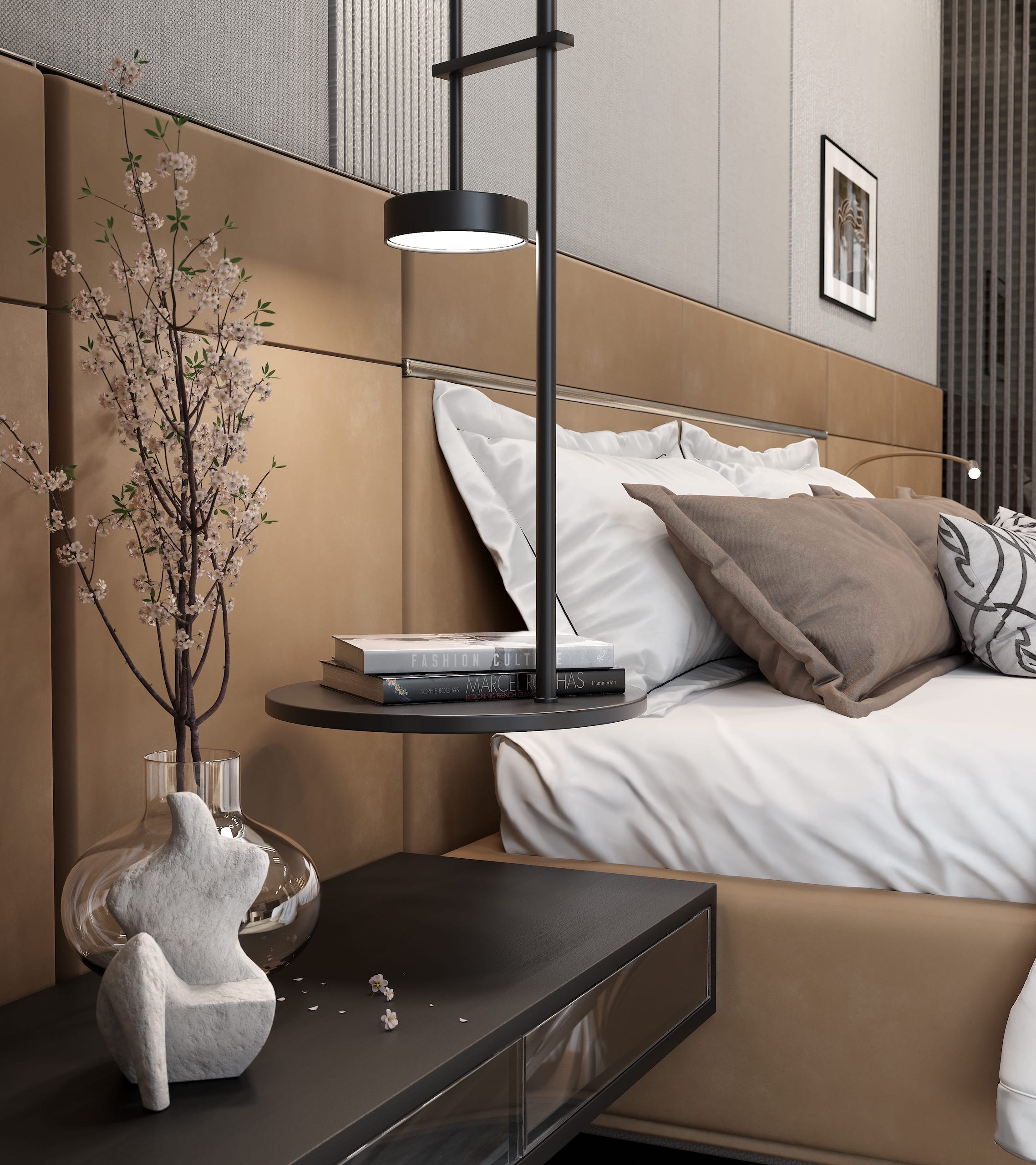
- Earthy neutrals color meaning in interior designsof these shades create a warm and cozy feel without being too stimulating.
Additionally, avoiding overly bright or intense colors in interior design psychology in bedrooms, such as vivid reds or oranges, is recommended, as they can be too energizing and disrupt sleep quality.
Ideal Colors for Living Rooms and Offices
The living room is a social and entertaining space, so warm and inviting interior design and colors work best. Popular choices include:
- Warm neutrals (beige, tan, light brown) colors create a cozy and welcoming atmosphere.
- Soft yellows infuse the space with warmth and positivity, making the room feel cheerful and lively.
- Muted greens or blues provide a sense of harmony and relaxation, making the space feel comfortable and inviting.
- Smallaccent color pops of red, orange, or deep blue can enhance energy and add character to the design.
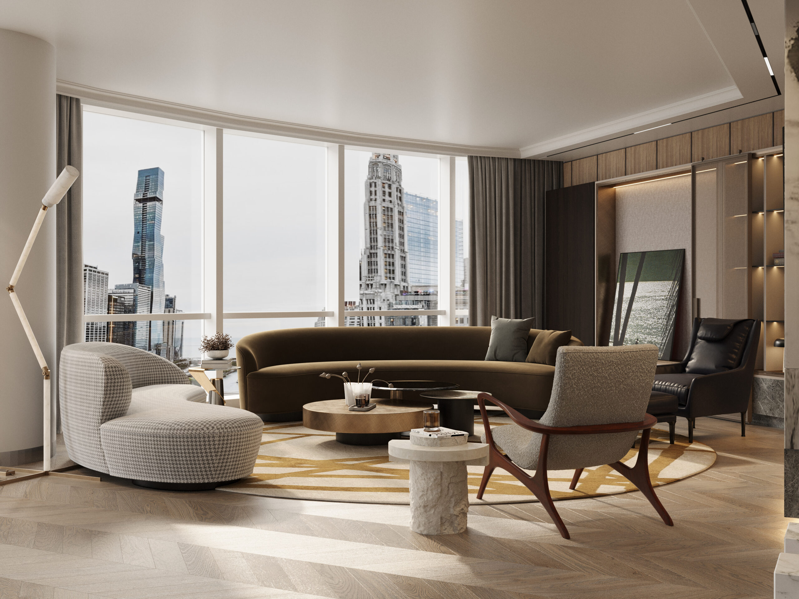
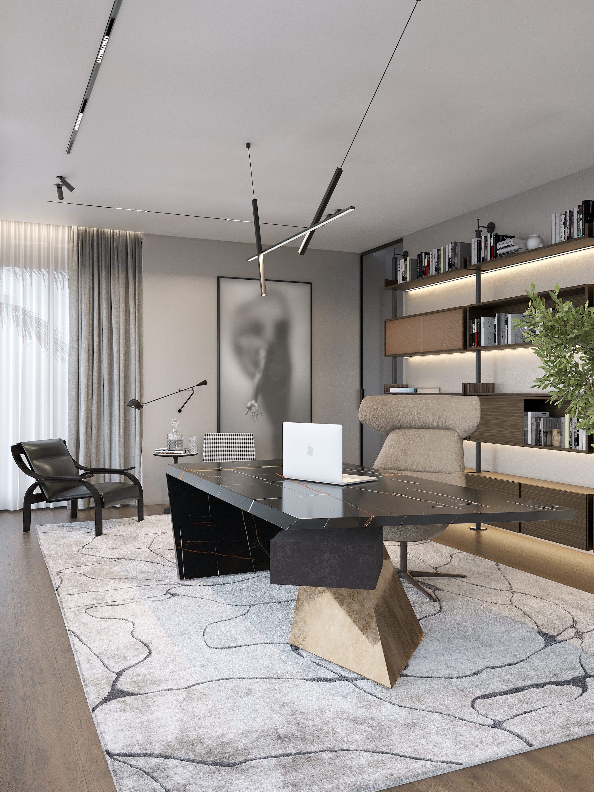
In offices productivity and concentration are key when designing office spaces. The best colors in interior design would include:
- Blue enhances focus, reduces stress, and increases productivity.
- Gray encourages balance and neutrality, preventing distractions.
- Green helps reduce eye strain and promotes a sense of well-being.
- Soft neutrals with subtle pops of color prevent monotony while maintaining a professional and structured atmosphere.
Conclusion
Colors in interior design definition is about more than just visual appeal. Color psychology interior design is about creating an atmosphere that aligns with the purpose of a space while positively influencing emotions and behaviors. By understanding the psychology of colors, homeowners and designers can craft environments that enhance well-being, productivity, and overall harmony. Thoughtful color selection, when guided by both science and intuition, transforms interiors into spaces that not only look good but also feel good to live and work in. With a deeper knowledge of color psychology, designers can make intentional choices that elevate the functionality, mood, and overall experience of any space.